
Overview
ShareConnect is a product that lets you access your computer from anywhere in the world and from any device.
Imagine you are an accountant, and you work out of multiple client locations. You have desktops that you work on in each of these locations. With ShareConnect, you can access all of these computers using the ShareConnect app without physically traveling to any of these locations.
For this case study, I will be focussing on the ShareConnect Mac desktop app.
ROLE
Product Designer
Interaction design, Visual design, User testing
---
Jan 2017 - April 2018
Product Designer
Interaction design, Visual design, User testing
---
Jan 2017 - April 2018
The problem
The team that had been asked to raise the customer satisfaction score of ShareConnect. The score we were using, called Net Promoter Score or NPS, is used to assess the likelihood of a customer recommending your product or service to others. I took this as an opportunity to look for areas for design to support this goal.
The discovery
After going through the NPS survey results and going through qualitative feedback from users, I reached out to these users to discover insights that would guide our direction.
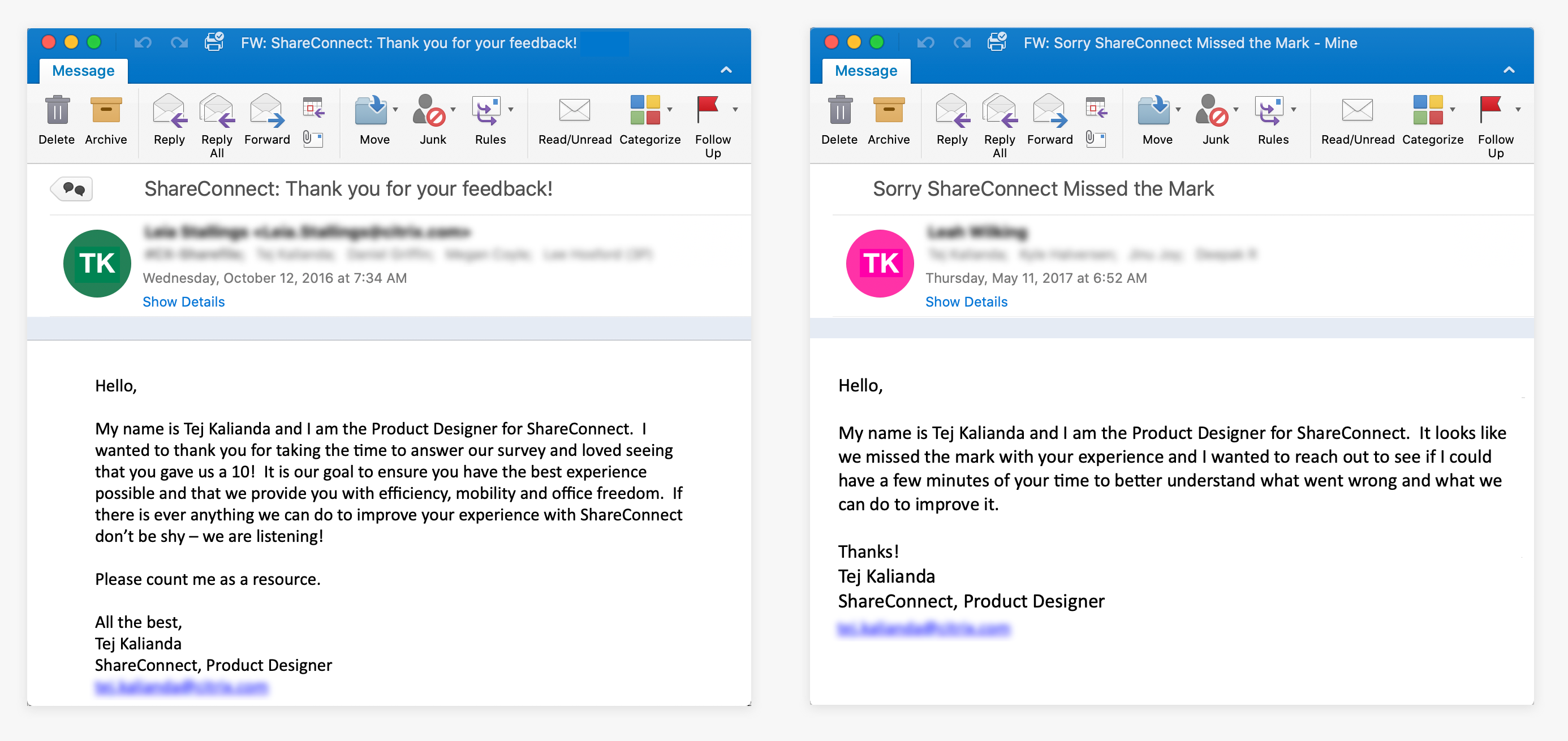
Emails sent to promoters and detractors, respectively
- The highlights:
-
From detractors: They thought ShareConnect didn’t work.
-
From promoters: They loved the ease and simplicity of use.
I got on the phone with detractors who were willing to spend some time with me to understand the top frustration of “ShareConnect doesn’t work”. I discovered that these users abandoned ShareConnect when a connection was trying to be established. It took too long, and they assumed it was broken.
It took an average of 35 sec for ShareConnect to establish a connection with the remote computer.
The Goal
We arrived at focusing on improving the connection speed as a critical factor to improve NPS.
However, there was a problem.
Improving the connection speed was a complex engineering problem to solve because it depended on many factors, some of which are:
- Operating Systems of the local computer and remote computer
- Network speeds at both ends
- Distance from server
Design Ideas
How can we occupy users’ time while they wait for a connection to be established?
ShareConnect doesn’t know how long it will take to establish the connection, so I explored ways to show indeterminate progress.
I designed a set of graphically rich ‘connecting’ screens to keep users entertained.
-
These images are picked at random and show that a connection is being made.
-
The same two sets of images are not always combined together and are not the same for every connection. This adds an element of surprise.

Early sketches leading up to the designs


The below prototype is for an iPad, but the same designs are used in the desktop app. Click on the red click hotspots to follow along.
These are all the different scenes I designed. They are picked at random when a user is connecting to their computer.

Error States
Once I created artwork for the “Connecting” state, I wanted to expand this to other areas in the product. Digging into the NPS feedback, users were frustrated with another area - ShareConnect seemed riddled with errors.
“It’s very buggy.” “It’s always telling me there’s an error.”
I sat down with the engineering team and looked at the code to see the scenarios when we presented users with the error message.
“It’s very buggy.” “It’s always telling me there’s an error.”
I sat down with the engineering team and looked at the code to see the scenarios when we presented users with the error message.
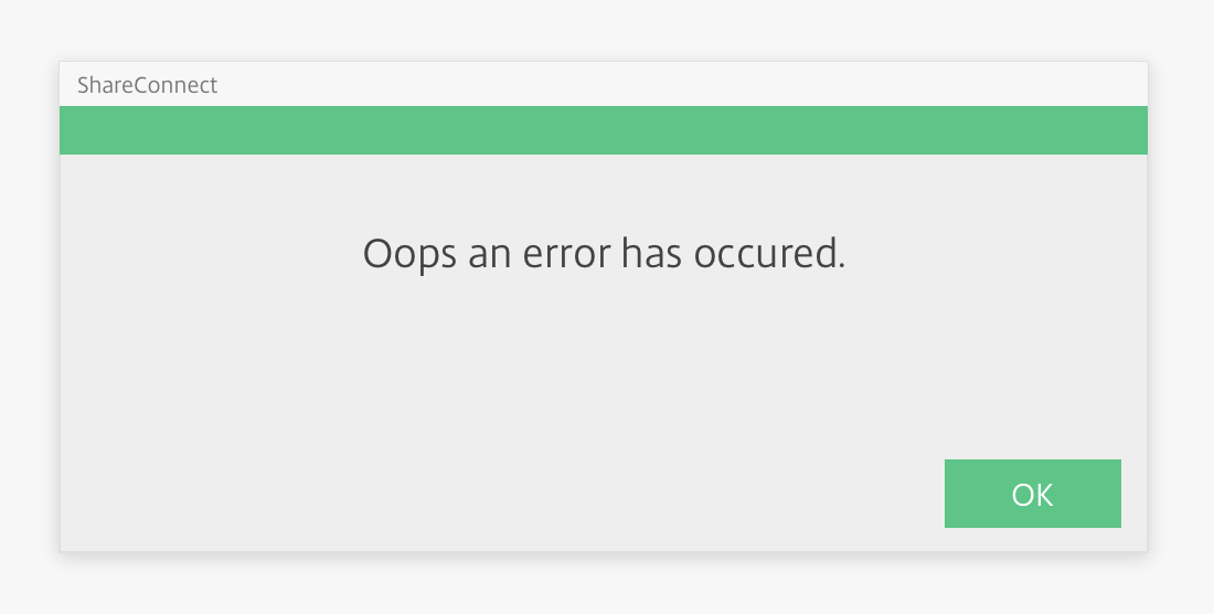
Old error screen
Not all the scenarios were indeed errors. If ShareConnect didn’t call these out as “errors”, users are less likely to perceive them as errors.
I used illustrations to create screens for these different scenarios, telling users if there was a problem, what it was and what they can do about it.
I used illustrations to create screens for these different scenarios, telling users if there was a problem, what it was and what they can do about it.

New design of the different failure scenarios
Not-Connected States
I improved messaging throughout the product by injecting this new personality to clearly communicate complex technical messages and created illustrations for each scenario.
Results
The team measured NPS for three months after the launch of the new designs.We saw NPS jump from 40 to 45, and we got a lot of love.
Qualitative feedback improved too -
“Shareconnect is so quick and easy.”
“I love how seamless the connection is.”
“LOVE IT”
 Cheers!
What I Learnt
- Users are strongly influenced by the product's aesthetics, even when they try to evaluate the underlying functionality. Aesthetic designs, in general, look easier to use and have a higher probability of being used, whether or not they are easier to use.
- Illustrations speed up data perception.