Data visualization dashboards
Presenting stories in the data to help users make meaning of complex informationImportant stories live in the data. My job is to work with cross-functional teams to discover and understand these stories and present them to our users.
Below, I will walk you through some of my work in data visualization for the Citrix Analytics product.
ROLE
Product Designer
Interaction design, Visual design, User interviews/testing
---
Sep 2020
Product Designer
Interaction design, Visual design, User interviews/testing
---
Sep 2020
CASE STUDY 1
Understanding employees’ work patterns in a WFH world.
Understanding employees’ work patterns in a WFH world.
Background
With the coronavirus pandemic, which has made working from home a necessity for thousands of companies, employers are left wondering how much work is going on. The fear of productivity losses has encouraged many companies to ramp up their employee monitoring efforts.
Defining the project
The product manager and I spoke to customers to understand what they needed:
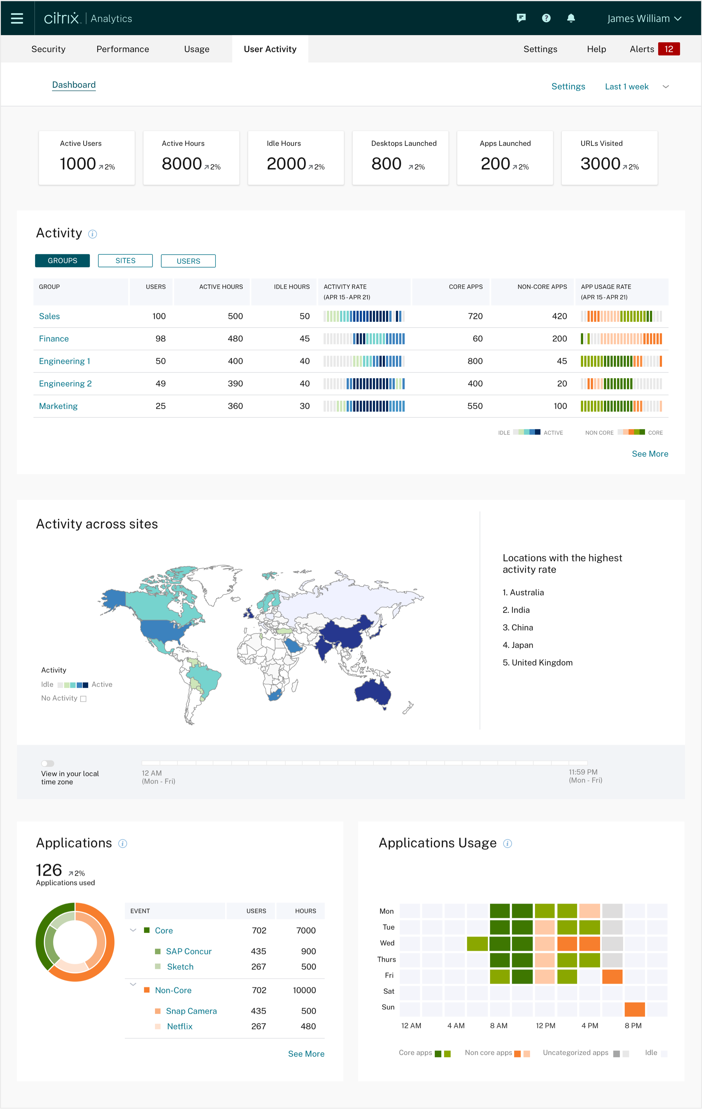
- Measuring employees’ active and idle hours across different sites/locations
- Measuring active and idle hours outside of regular business hours.
- Measuring highest and lowest used applications
- Better employee insights. Monitoring employees doesn’t just identify the lowest performers—it also spotlights the highest performers.

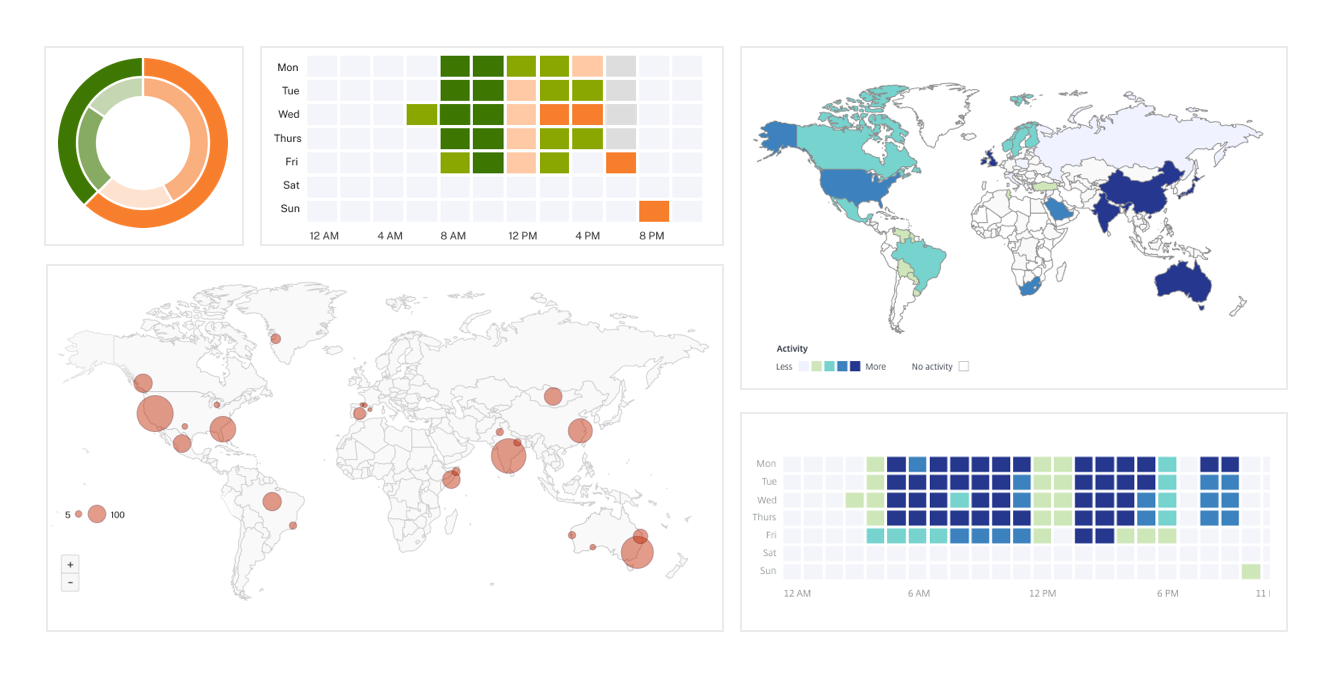
Early sketches
Dashboard design
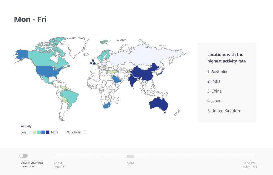
It was important for users to know which sites displayed maximum activity and at what times and days this activity exhibited.
E.g., a higher than usual activity outside of regular business hours is of greater criticality than just more elevated than regular activity.
I designed this interaction (below) to the geo map. A user can use the toggle switch to view total activity regardless of local time or switch to see activity at a specific local time.
Customer feedback
“I can tell you 100% that the types of statistics, this type of analytics, it's, it's needed. I would say that probably from the from the administration level, that's one hundred percent perfect.”
Large US consumer goods corporation
(Reference to Dashboard and overall charts presented)
(Reference to Dashboard and overall charts presented)
“… high level summary, it's useful on the apps that you don't want people spending a lot of time on to, like, see, like, OK, as an organization, we wasted 10000 hours of people browsing Facebook.”
Large cloud solutions company
(Dashboard reference to applications chart)
(Dashboard reference to applications chart)
CASE STUDY 2
Where are my users logging in from
Background
With more companies working with geographically distributed teams today, more employees are working remotely than ever before. Remote work poses unique security challenges for companies. Because employees are not physically working on-site, they're often relying on their Wi-Fi networks and devices to access company data.
To mitigate security risks, companies want to implement clear and comprehensive policies and take proactive measures to ensure the safety and integrity of company data.
Defining the Project
The product manager and I spoke to customers to understand what they needed:
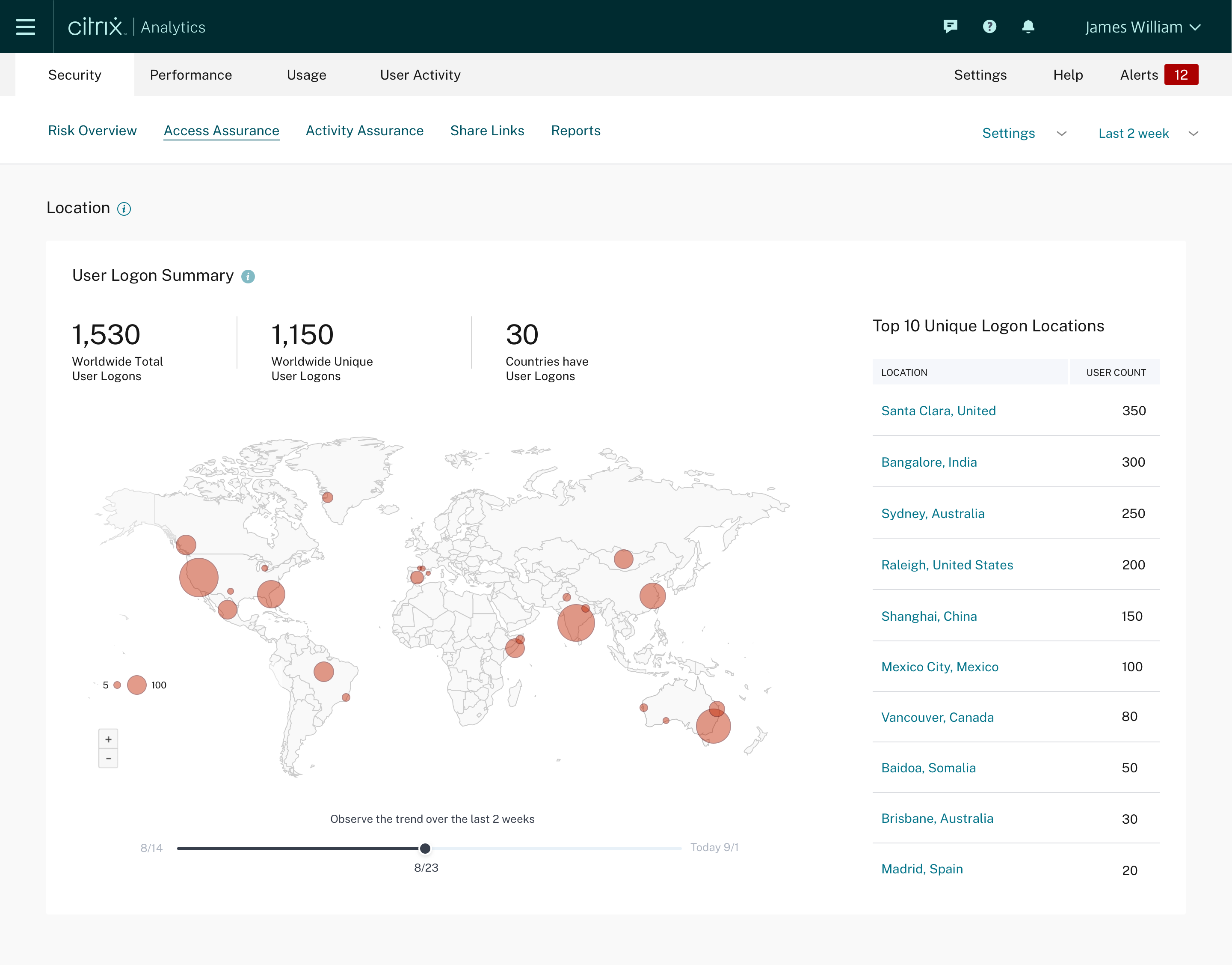
Companies wanted to gain insight into the locations that their remote employees are accessing company resources from.
Dashboard design
We tested this with customers, and it emerged that they cared a great deal about the rate of increase/decrease in the number of access from a location. A faster or slower increase/decrease is an indicator of abnormal activity.
I designed this interaction (below) which allows users to move through the timeline and view growth/decrease patterns over time.
I designed this interaction (below) which allows users to move through the timeline and view growth/decrease patterns over time.