
Citrix Analytics - Dashboard design
Giving users actionable insights from complex dataOverview
Citrix Analytics Solutions (CAS) is a product designed to help organizations detect and mitigate potential threats. Trusted by thousands of organizations across industries—such as banking, education, government, healthcare, and manufacturing—CAS ensures both productivity and the protection of intellectual property.
ROLE
Product designer, Product design manager
Interaction design, Visual design, Information architecture, User research
---
Jan 2020
Product designer, Product design manager
Interaction design, Visual design, Information architecture, User research
---
Jan 2020
The challenge
As the Product design manager, it was my responsibility to improve the product experience and identify product opportunities to increase user adoption and engagement.
Because the landing page was critical to users to get a comprehensive view of their organization, improving this experience was an opportunity to build something beneficial for users while increasing user engagement.
Defining the problem
Users struggled to find value in CAS, as they felt it didn’t capture all potential threats.
The original dashboard, designed for smaller scales, displayed only 30% of threats, falling short for larger organizations. I needed to find a way to surface other critical threats that were buried deeper within the inner pages.

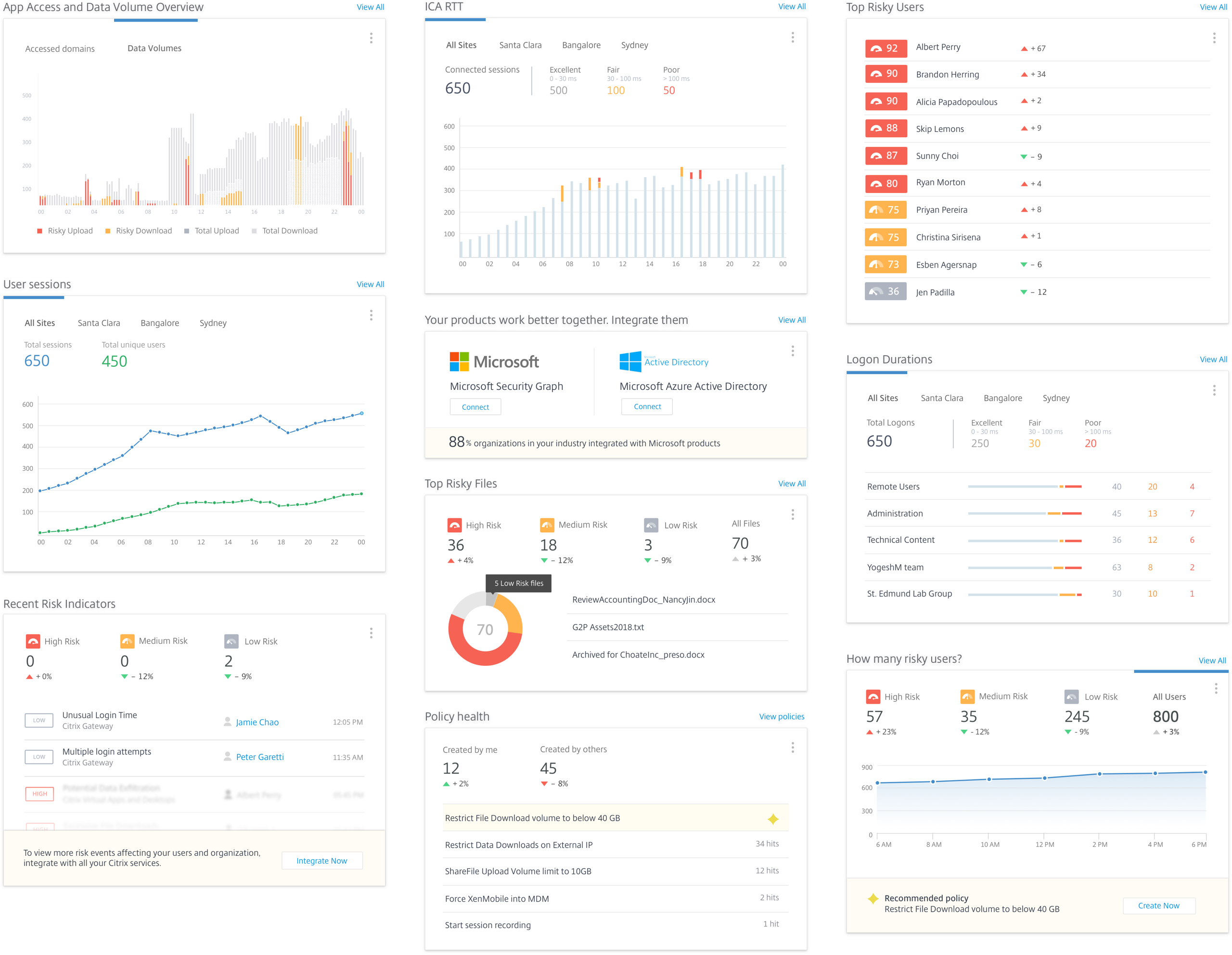
Original dashboard design
What do users find valuable
To understand what users find valuable, I interviewed 6 CAS users to explore key questions:
- When do they launch CAS?
- Why do they use it?
- What challenges do they encounter while using CAS?
- What types of analytics do they find most useful?

Designs - Part 1
Designing the dashboard presented a challenge, as every piece of information felt critical. From user research, I discovered that users prioritize seeing their current health status alongside any urgent updates, warnings, or alerts that require immediate attention.
To address this, I designed a card-based dashboard, where each card offers a high-level summary with clear, intuitive paths for users to explore more detailed information as needed. This approach balances clarity and accessibility, ensuring users can quickly grasp important insights while having the flexibility to dive deeper when necessary.

Dashboard views for different users
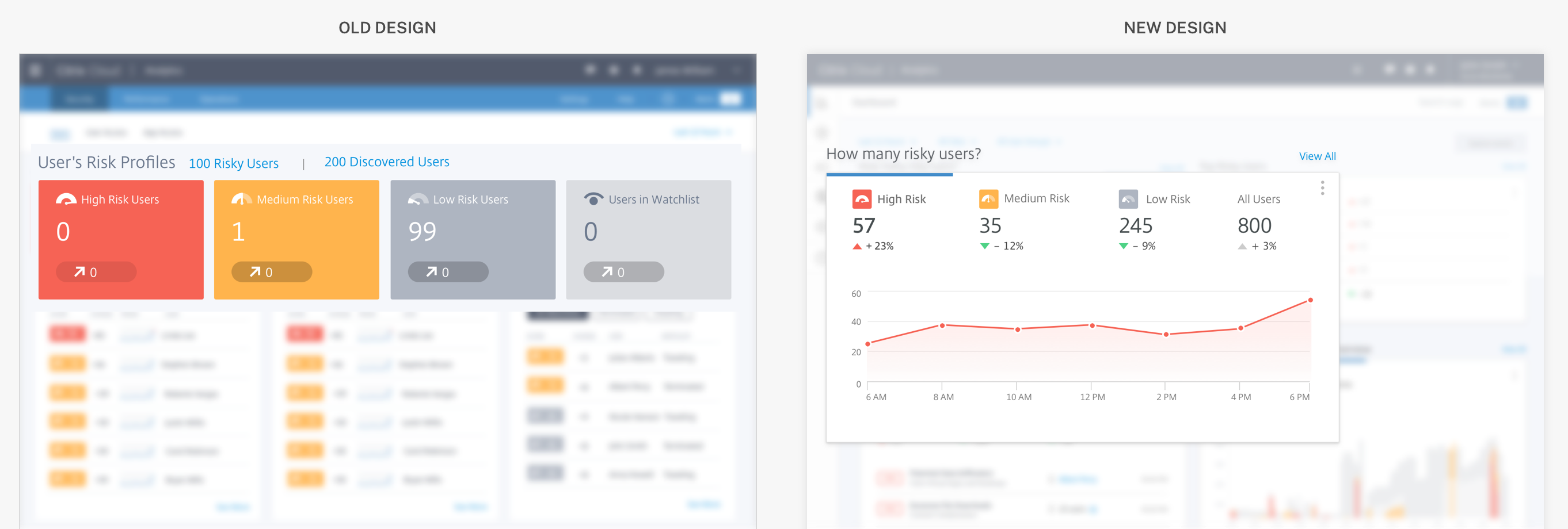
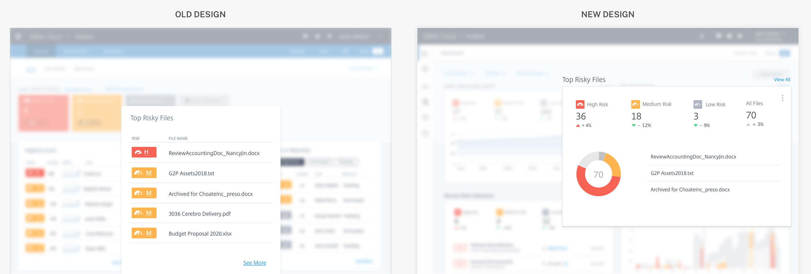
No one size fits all
What’s considered "urgent" can vary from one user to another. To accommodate this, I designed customizable cards for each type of critical notification, ensuring that users see alerts tailored to their specific needs and priorities.
Cards for different scenarios
User Validation - Qualitative
I tested this new card design with users and the overall response was very positive.
Key highlights
1. Users responded positively to the inclusion of trend lines, finding them more insightful than standalone summary numbers.
2. Graphs and charts enabled users to quickly absorb and understand the data.
3. Users consistently found the dashboard to be a reliable source for relevant information.
User validation - Quantitative
The dashboard designs I previously validated with users were adapted into an email template, replacing the old notification system. This new format was used to gather valuable data, such as:
- How many users open the email?
- Do the notifications drive users to visit CAS?
- What actions do users engage with?

Reception and Results
Email opens became a key leading indicator, and we tracked the rate at which users engaged with notifications. Based on this data, I designed action-oriented cards within the emails to encourage users to take specific actions.
Smart recommendations
Nudge users to take recommended actions.

Promoting features
Promote new or underused features in the product which are of business value.
Promote new or underused features in the product which are of business value.
Design update - Part 2
After validating the new designs with users, Citrix unveiled a transformed brand identity. I seized this opportunity to incorporate a modern, clean, and minimalist aesthetic reflective of the new Citrix brand into CAS.
The key attributes that I emphasized on were:
- Informative
- Actionable
- Confidence-building
I led a team of four designers to develop the final version, which I presented to our stakeholders to refine our design direction.
The key attributes include:
The key attributes include:
- Improved Scannability: Ensure users can quickly find what they’re expecting within the first few minutes.
- Glanceability: Highlight key data and metrics to facilitate faster task completion and goal achievement.
- Focus on Critical Data: Eliminate unnecessary visual elements, allowing users to concentrate on essential information by minimizing extraneous pixels, space, and other UI elements.

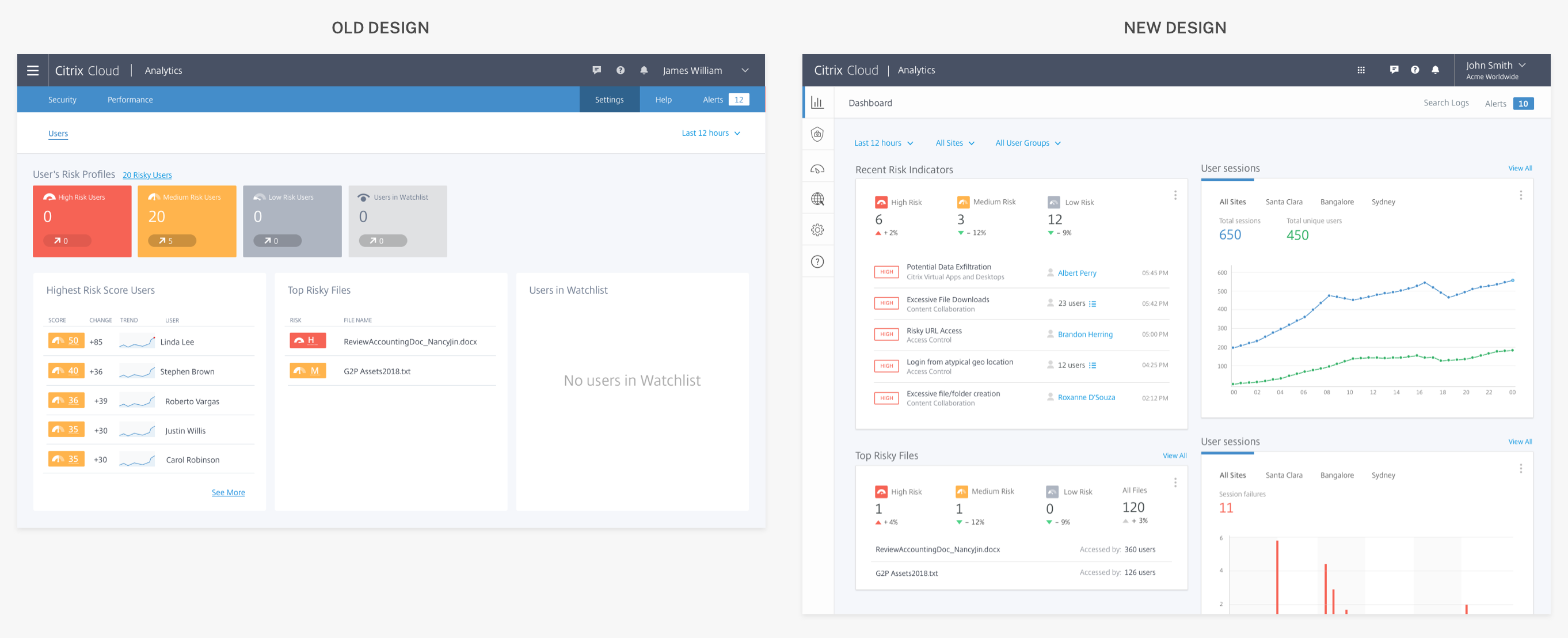
Design of the new landing page
Key elements
Below are some key elements on the dashboard.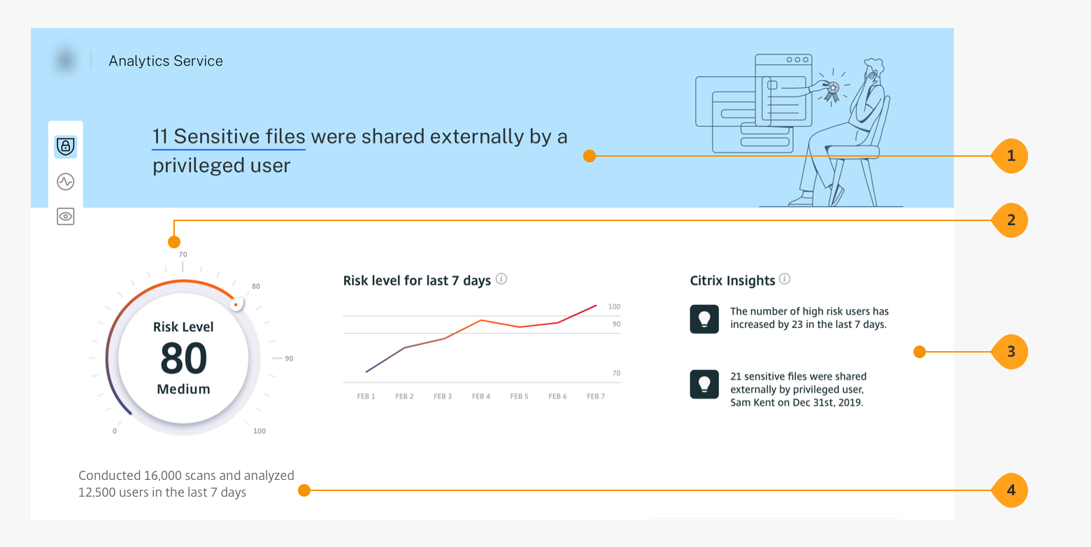
1. Top: What is the most critical alert?
2. Overview: How is my system doing?
3. Top alerts: Most crucial alerts from a Citrix admin’s long list of alerts.
4. Behind-the-scenes: Magnitude of work that takes place in the backend.
2. Overview: How is my system doing?
3. Top alerts: Most crucial alerts from a Citrix admin’s long list of alerts.
4. Behind-the-scenes: Magnitude of work that takes place in the backend.
1. Better or worse: Has it gone up or down?
2.Trend: How have the last fewe days been?
2.Trend: How have the last fewe days been?

Extending the design to other pages
I led a team of 2 designers to redesign key inner pages after we nailed down the landing page. We applied foundational principles already defined.
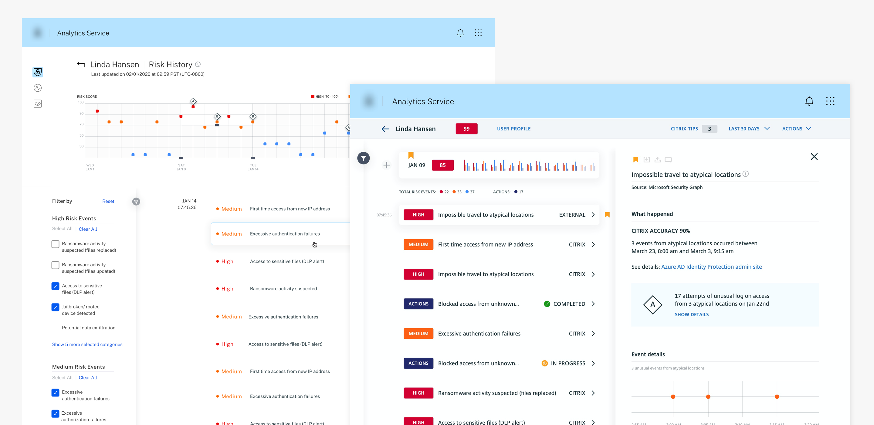
New designs applied to other pages to improve scannability
One more thing ...
Dark mode
A key insight from the user research led to creating a dark mode version of the designs - A large number of our users use CAS in low-light environments such as server rooms and NOC centers.

New designs in dark mode
Challenges and Compromises
Unfortunately, one of our main challenges is the lack of resources and time that we have; we're stretched relatively thin! With this challenge, I often have to reiterate my designs to be achievable within time and technical constraints while still providing value to our users.
- In the earliest version of the redesign, I created a design highlighting the search bar on the dashboard. Still, since our search indexing was not mature enough, I moved this out to a later version described in this case study.
2. I created a design that would send notifications to the end user's Citrix Workspace app each time CAS triggered a threat. Since this would require significantly more development time, we continued to send the post-threat email summarizing essential events.

3. Due to the niche nature of the product, it was hard to recruit user test participants and on short notice. To avoid allowing this to be a blocker, I often jumped on customer calls that my Product Manager ran and squeezed in a few minutes to get design feedback.
Learnings and Takeaways
I discovered that a design compromise stemming from technical limitations doesn’t have to equate to a diminished user experience. By fostering open communication, thinking creatively, and being willing to explore unconventional solutions, we can often develop alternatives that effectively meet users’ needs
“The easiest part of all was setting up Citrix Analytics. It was just click, click, connect. We loved the simplicity of it.”
Kyle E
Deputy CIO of a city government
Deputy CIO of a city government